La Colaborativa × TuftsLaunched
Accessible Bilingual Intake: Kiosk + Paper
Redesigned the front door of a community nonprofit that sees up to 500 walk-ins a day: a touchscreen kiosk and a bilingual paper form that flag emergencies at first contact. Both passed all 5 usability criteria and launched in June 2026, connected to the organization’s Salesforce CRM.
Project snapshot
- Role
- Project Manager / Client Communication Manager & Designer
- Client
- La Colaborativa, Chelsea, MA
- Context
- ENP 161 Human Factors Product Design, client project
- Timeline
- Jan – June 2026
- Methods
- Site visit, staff interviews, document + literature review, personas, usability testing
- Tools
- Figma (kiosk prototype), CAD (kiosk stand), print form design
- Status
- Launched June 2026: paper form + kiosk in use, integrated with Salesforce
The problem
La Colaborativa is a Latina-led nonprofit in Chelsea, Massachusetts that has served the Latinx immigrant community since 1988. Housing, food, immigration, legal, and healthcare support all start at one front door, with up to 500 walk-ins a day.
That front door was entirely manual. There was no standard way to capture information, no way to flag the most urgent cases, and no reliable link to the organization’s database. An earlier form-based process had been abandoned because it was too slow under pressure.
The constraint
People arrive in crisis and staff have almost no margin, so a slow or confusing intake isn’t an inconvenience. It’s a barrier to getting help.
We set four goals: reduce front desk burden, improve accessibility, flag urgency at first contact, and build toward integration with the database staff already use.
Users & research
- Site visit: observed the intake area, the outdoor entry space, the front desk workflow in real time, and how people were feeling as they arrived.
- Semi-structured interviews with front desk staff and case managers. The open format surfaced pain points a survey would have missed.
- Review of internal triage documentation covering more than a dozen service tracks.
- Literature review: human factors, Universal Design, crisis communication, and medical triage models.
Intake is emotionally high-stakes
Staff calm people down one by one. The process itself gave them no help, so the effort fell on people instead of the system.
Language and literacy are barriers
Many community members can’t complete a text-heavy form, on paper or on screen, without icons, visuals, and translated content.
Urgency relied on intuition
Nothing at intake separated an emergency from a routine visit, often during several conversations at once.
Trust comes first
People who feel disoriented or watched at check-in are less likely to engage with services at all.
We turned the research into three personas: a Spanish-speaking single mother with limited tech comfort who wants to feel heard and guided; a bilingual 18-year-old, first-generation student who is wary of sharing personal data; and a front desk staff member who wants to move people to the right service faster.
Process
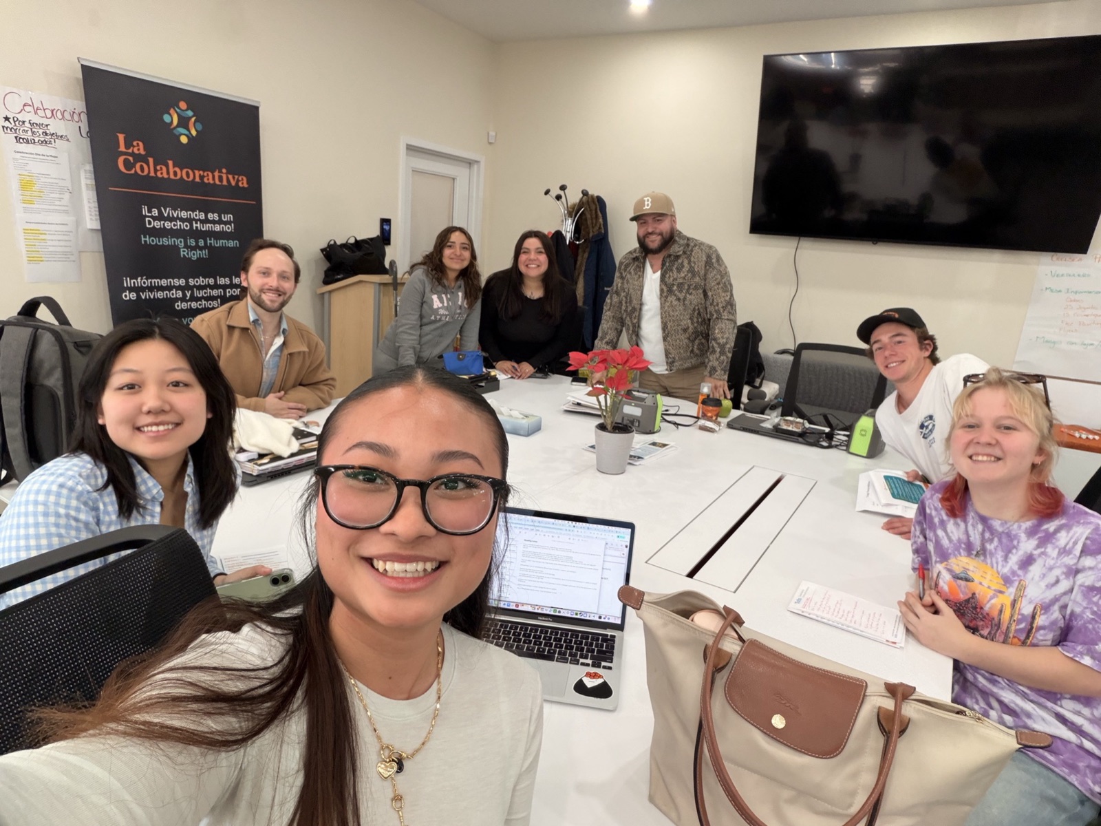
As project manager, I kept the project on track and was the bridge between La Colaborativa and our team:
- Ran weekly communication with 5+ client and project team members, turning community needs and staff feedback into design requirements.
- Designed and refined 15–20 bilingual "Calmline" communication templates, written for clarity, trust, and a clear next step.
- Folded user feedback and testing insights back into the intake flow.
- Led the June 2026 launch: met with La Colaborativa staff to walk them through the paper form and kiosk and guide them through the switch to the new intake process.
Decision: two front doors, one system
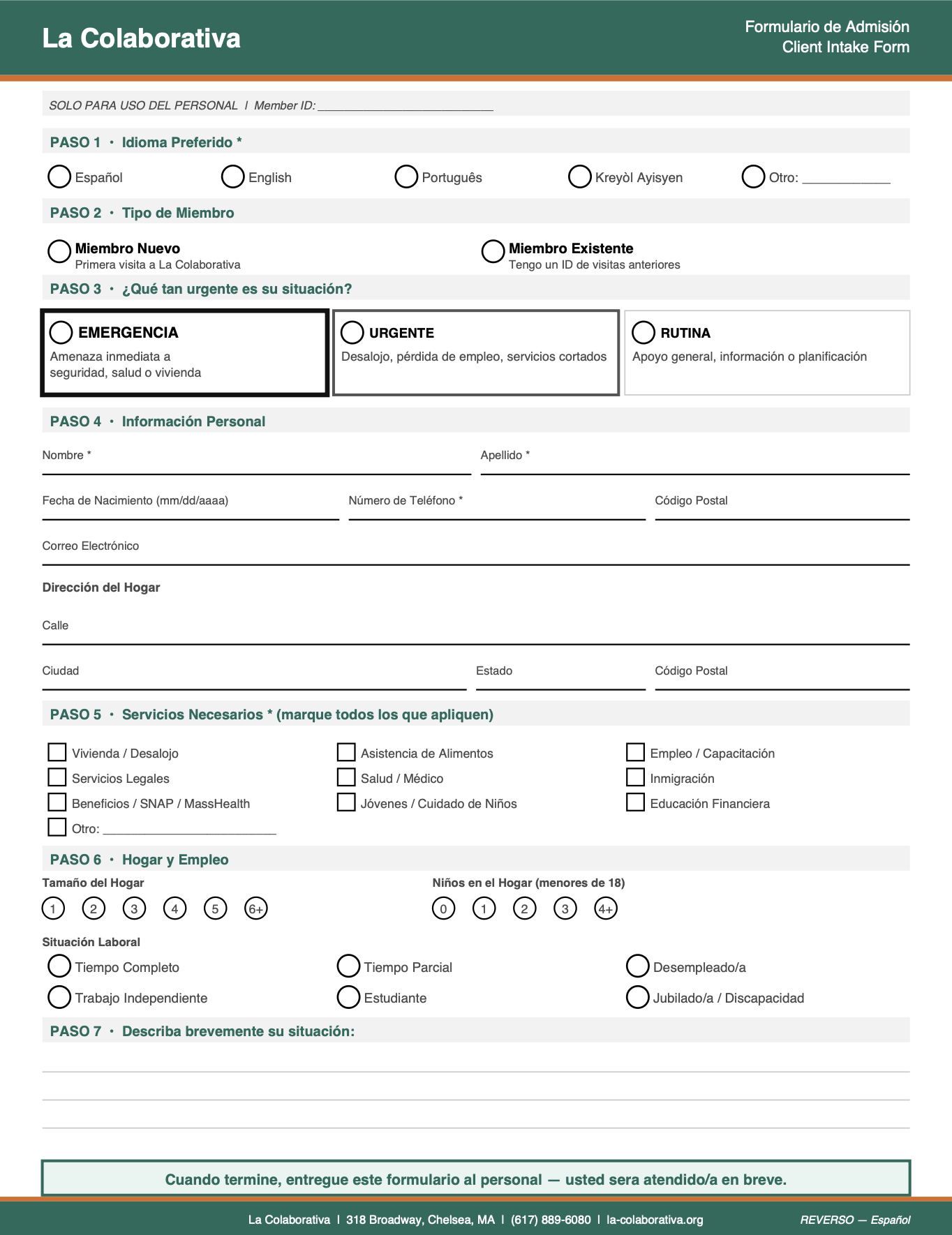
A touchscreen kiosk for people comfortable with it, and a bilingual paper form as an equal path for anyone who isn’t. Both ask the same questions and flag urgency the same way.
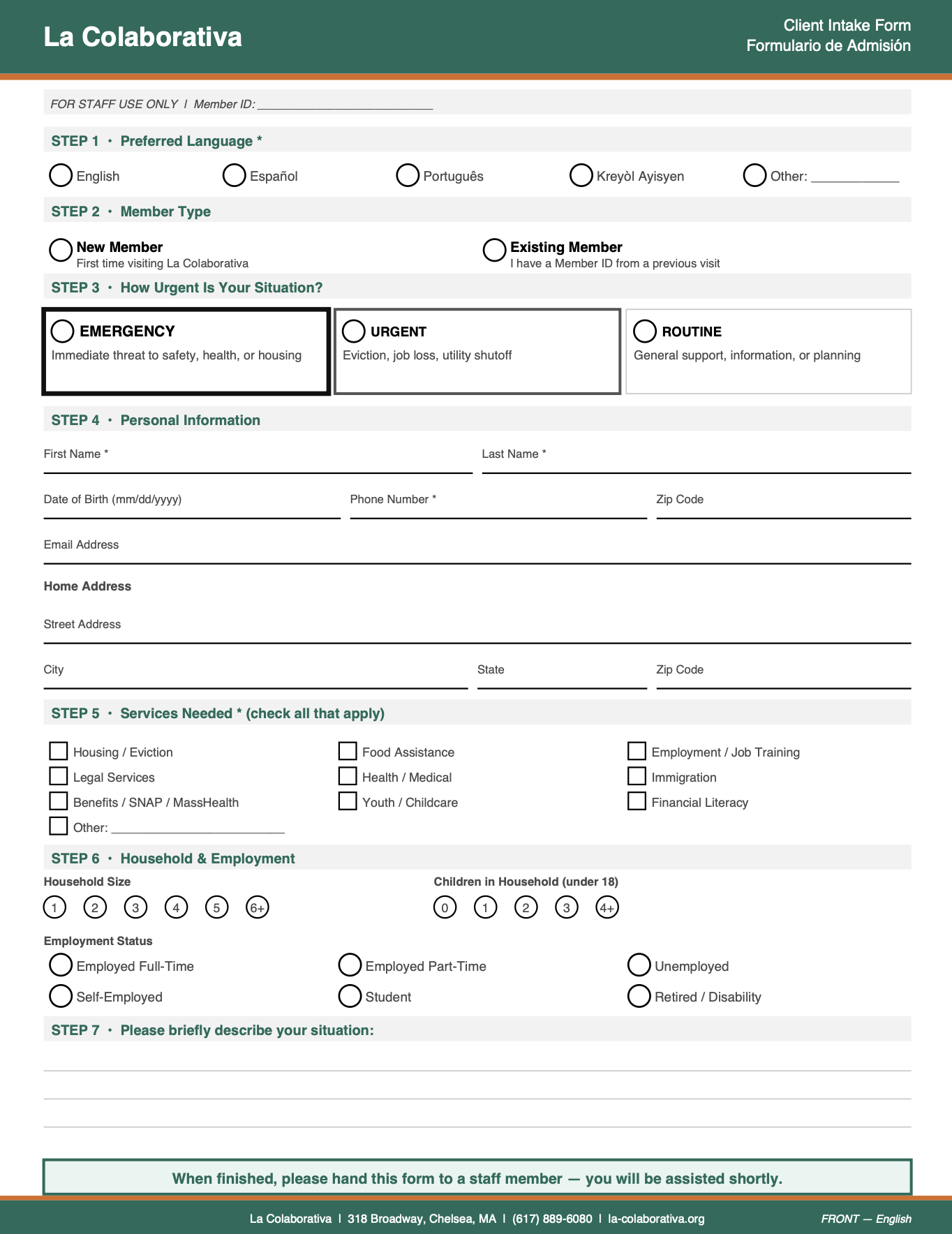
Reviewing the first paper prototype surfaced six problems. Each one changed the design:
Language was buried → Step 1
Language choice moved to the very first step, written in each language’s own script.
Text too small → bigger, one page
All text enlarged, and each language fits on a single page.
Tiny bubbles → doubled
Bigger targets for unsteady hands, and fewer scanning errors.
Color-only sections → contrast
Structure carried by shading and line weight, so it works for colorblind users.
Vague urgency → border weight
Emergency, Urgent, and Routine boxes readable at a glance, without color.
No next step → hand-off note
“When finished, please hand this form to a staff member. You will be assisted shortly.”
What we built
The kiosk flow, screen by screen, with the reasoning behind each one:
Try the live prototype (opens in a new tab)
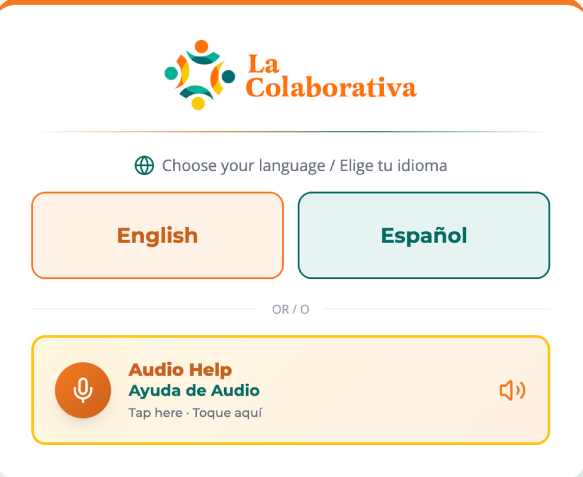
Step 1 of 6
Choose a language, or ask for audio
Language is the first choice, labeled in both languages. Audio Help is right there for anyone who can’t read the screen.
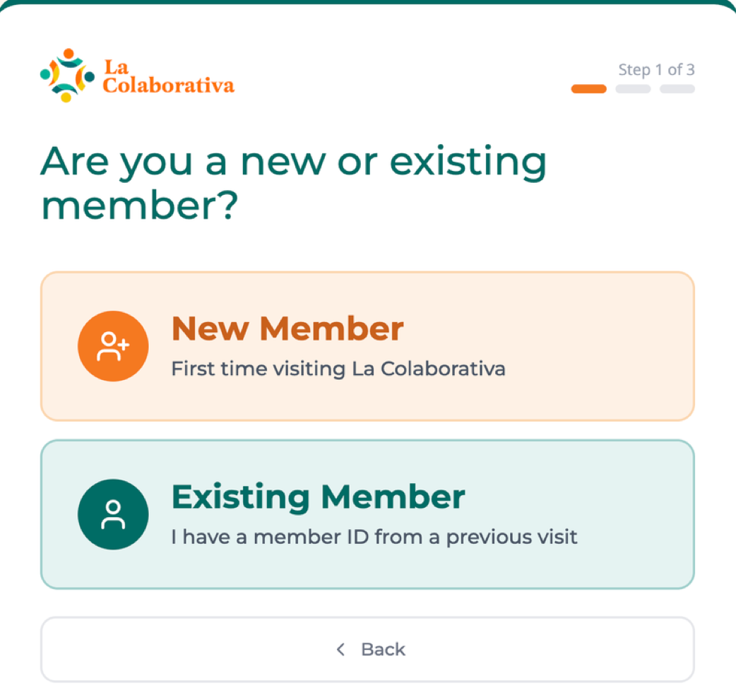
Step 2 of 6
New or returning
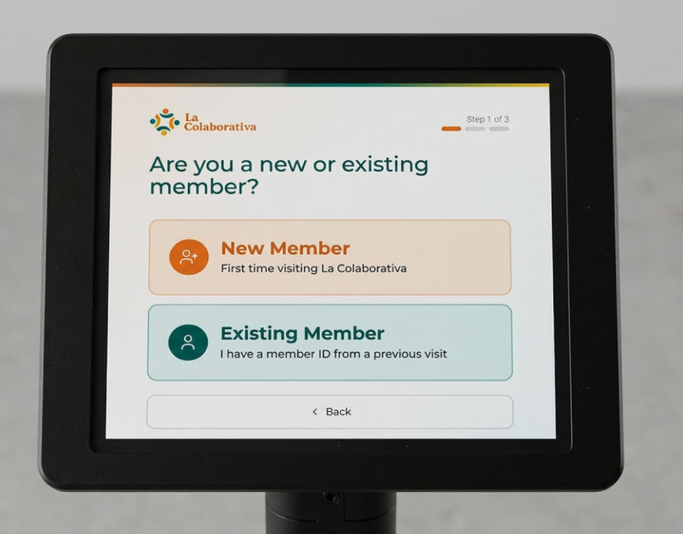
Two big choices with icons, and a “Step 1 of 3” counter, so people always know how much is left.
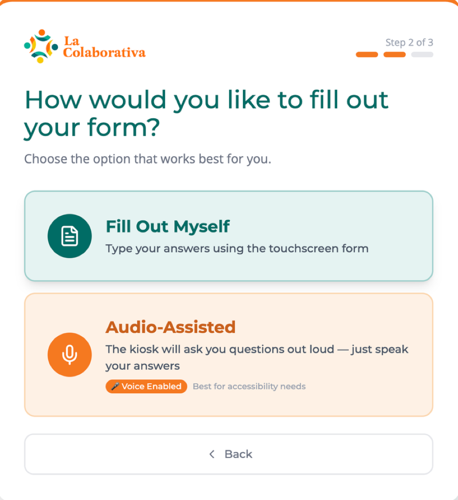
Step 3 of 6
Type it, or say it
Audio-assisted mode reads each question aloud and lets people speak their answers, for clients who don’t read or write.
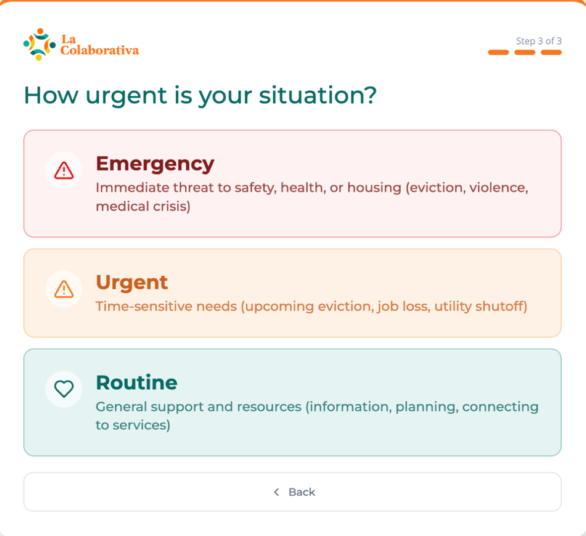
Step 4 of 6
How urgent is it?
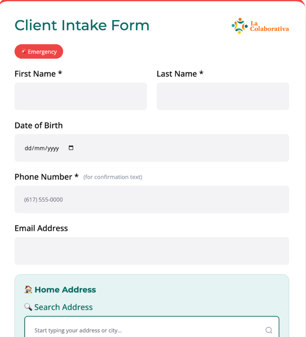
Emergency, Urgent, or Routine, with plain examples for each. Picking Emergency automatically alerts staff, so nobody in crisis has to explain it at the desk.
Step 5 of 6
Only the essentials
Short, structured fields, with the urgency tag carried along. Address search cuts down on typing.
Step 6 of 6
You’ve been heard
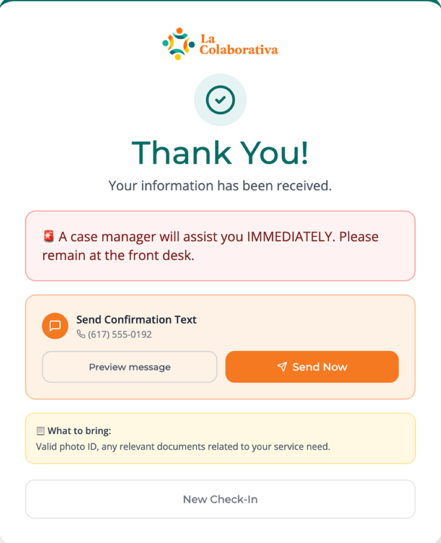
The emergency confirmation was the favorite feature in testing: instant reassurance, plus a confirmation text and what to bring.
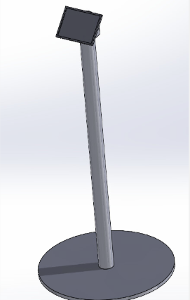
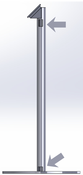
The kiosk itself is a freestanding iPad stand. We set the screen at 4.5 feet so it’s reachable for older adults, shorter clients, and parents with kids. Version 2 routes the charging cable through a hollow pole, so it can’t be tripped over or unplugged.
Outcome & impact
In use today
Launched in June 2026. La Colaborativa adopted both the paper form and the kiosk, and integrated intake with its Salesforce CRM. The organization reports a smoother front desk and more efficient work for staff.
Before launch, we usability-tested both prototypes against five success criteria we set up front, using persona-based scenarios: both client personas on each format, and the staff persona reviewing what came in.
- success criteria met, by both prototypes
- 5/5
- completed without assistance (3/3 on each)
- 100%
- minutes, average on paper (target: 5 or less)
- ~3.75
- minutes, average on the kiosk
- ~4.5
| Criterion | Target | Paper form | Kiosk |
|---|---|---|---|
| Complete without assistance | ≥80% | 3/3 (100%) ✓ | 3/3 (100%) ✓ |
| Average completion time | ≤5 min | ~3.75 min ✓ | ~4.5 min ✓ |
| Errors per user | ≤2 | 0–1 ✓ | 0 ✓ |
| Understand next steps | >50% | 2/3 ✓ | 3/3 ✓ |
| Hesitation points per user | ≤3 | 0–3 ✓ | 0–3 ✓ |
What staff valued most
The three-tier urgency flag. Border weights let the triage team sort a stack of forms in seconds, and on the kiosk an emergency alerts staff automatically.
Gaps testing exposed
- Typing open answers on a touchscreen was hard under stress. Lean on audio and selection over free text.
- The employment question confused people with informal work. Reword the options.
- The paper form needs a timestamp field for staff.
- The prototypes had no live Salesforce connection. The launched version now feeds intake directly into La Colaborativa’s Salesforce CRM.